5. Button
DESCRIPTION
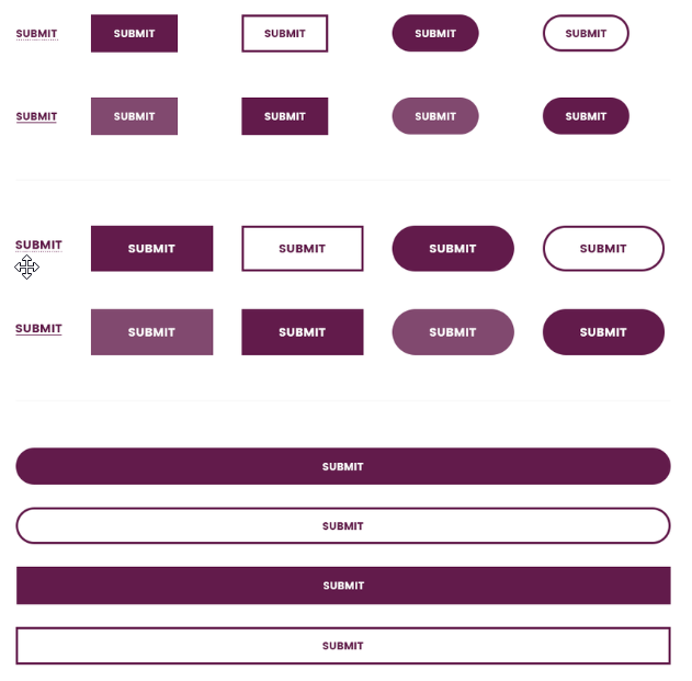
SCREENSHOT
THE CODE
[unidash_button style="" size="" url="" padding="" margin="" round_border="" alignment=""]1[/unidash_button]
PARAMS
- Button Text
- Style: Select icon box style.
- Default Style
- Bordered Style
- Text Style
- Size: Select icon box size.
- Default
- Large
- Full Width
- Text color: Hexa color of text
- Color of background: Hexa color of Background
- Color of hovered text: Hexa color of hovered text
- Color of hovered background: Hexa color of hovered background
- URL to navigate
- URL target: Select:
- Curent Tab
- New Tab
- Padding: Padding of Button. Default is ‘0px 0px 0px 0px’ (TOP RIGHT BOTTOM LEFT). Leave blank to use default style.
- Margin: Margin of Button. Default is ‘0px 0px 0px 0px’ (TOP RIGHT BOTTOM LEFT). Leave blank to use default style.
- Round Border: Round border of the button. ex: 5px. Default is not Bordered.
- Border Size: Border size of the button. Ex:5px
- Button Alignment: Select button alignment.
- Inline
- Left
- Center
- Right